I found this project quite a simple one, this might have been because the brief was clear and we knew what the client wanted so for me it felt like there was only a limited amount that I could produce creatively. Also that from the off we were to think of ideas and work present them to the client within a week. This meant that I had to come up with ideas quickly and I liked most of what I had pitched to the client.
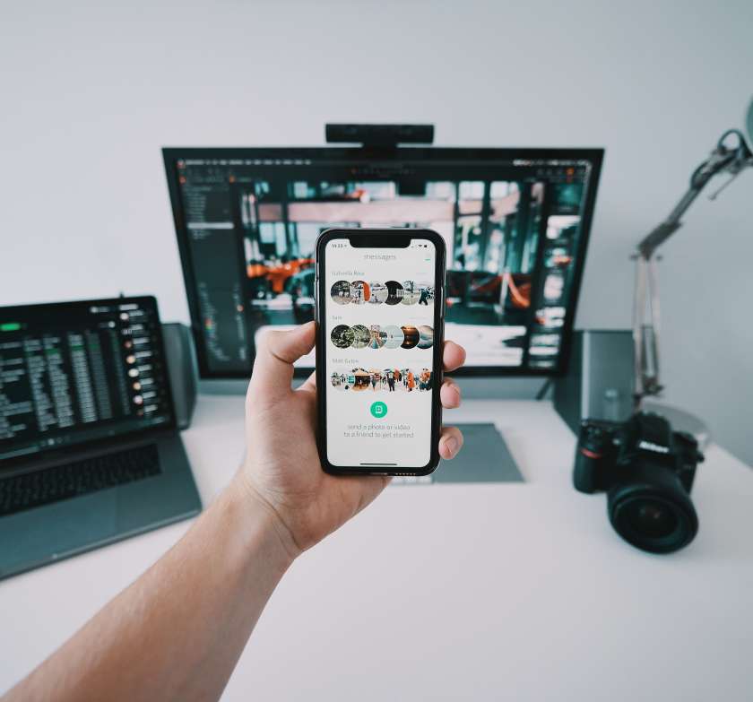
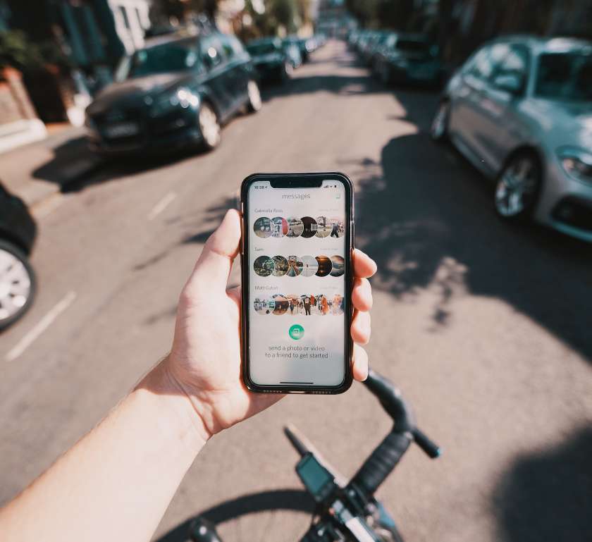
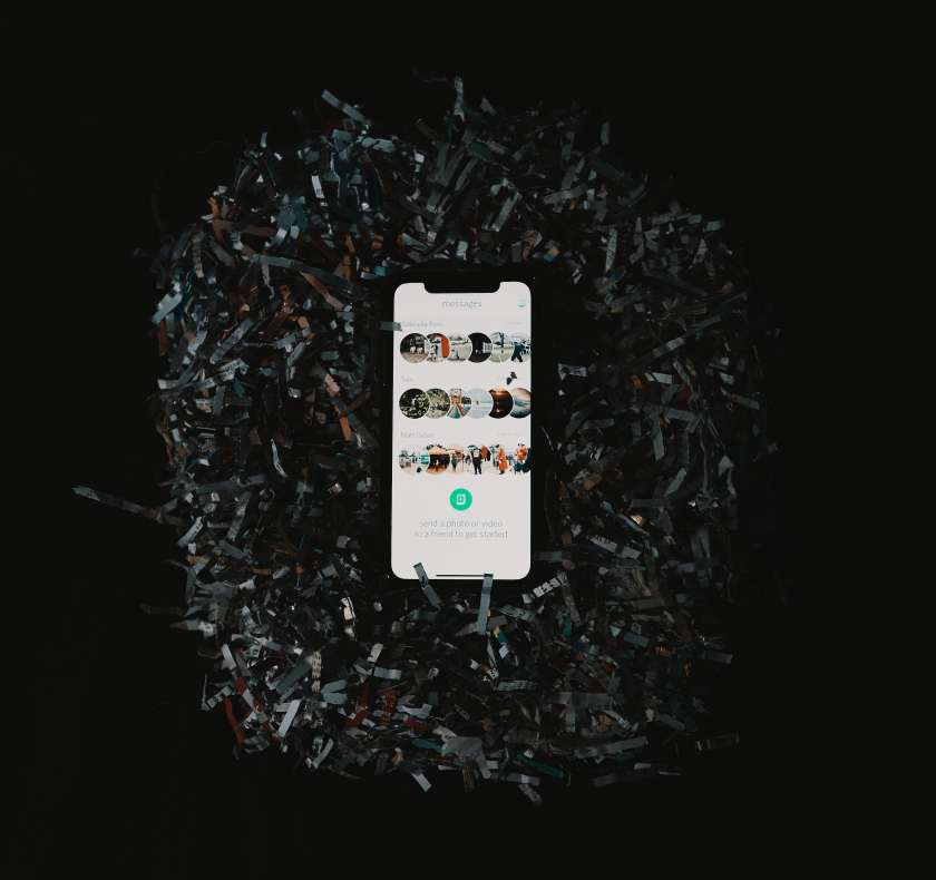
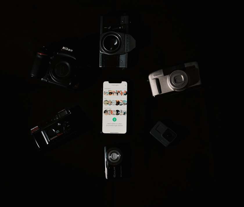
When I started the project I imagined that there would be 5 different images that didn’t really relate to each-other in any intentional way. It was only when I had started shooting that I realised that the app being front and centre was the best idea. It seems obvious when I look back on it bit I hadn’t really thought about the framing of each picture. I aimed to have the phone in the same proportions in each photo to a degree (that made sense in each image) meaning that the app was front and centre in all the subjects that I was aiming to cater for in the photos.
For me the images came out a lot better than I expected, having a brief idea of what I was doing. For each shoot I winged it to a degree, with a visual in my head. It wasn’t until the last two images that I had a clear idea of what I was doing and there was more purpose in the images. I think if I were to do this again I would have sketched out the photos before, just to aid in the clarity of what I was doing and I there was a client that I was working more closely with they would be able to contribute and say whether an idea was what they did or didn’t want.
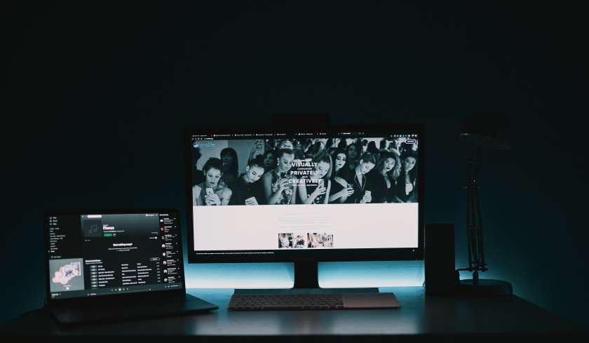
Here are all 5 images together